

It’s a known fact that content is the most superior when it comes to news portals. I believe that the seriousness of the news must always be respected, no matter what, and so, I always make it a point to uphold this even when I’m designing a news portal. In order to provide users with a meaningful reading experience while respecting the value of the news, there are certain things I always keep in mind. This ensures two things: the news portal is content-centric, and the users are happy. If you’re wondering how to do this, here’s what I do whenever I’m designing a news portal.
Content mapping is the first and most integral element of any successful news portal. As we all know, it is basically the process of making sure the right content is delivered to the right users, at the right time. As news portals are meant for the masses, content mapping helps prioritize the news, so seekers at the news portal can find the particular news of their interest with ease. This is done by strategically classifying and subclassifying the news into modules, which provides proper differentiation to the content, and also helps improve SEO. When all of this is done, we’re left with a wonderfully structured news portal, which is basically the perfect start to designing a dreamy digital news platform.
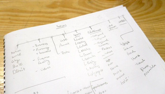
A news portal consists of hundreds of stories, and so, it’s extremely important to determine which sections need to be highlighted, and which stories are of paramount importance to the readers. Once you’re familiar with the major classification of the content, you can easily move on to prioritizing the news stories in each module. By intelligently organizing the hierarchy of the modules and stories, you’ll be able to easily know which story needs to be pushed to the top, and which stories are to follow. This way, a seamless reading experience will be created for the user.
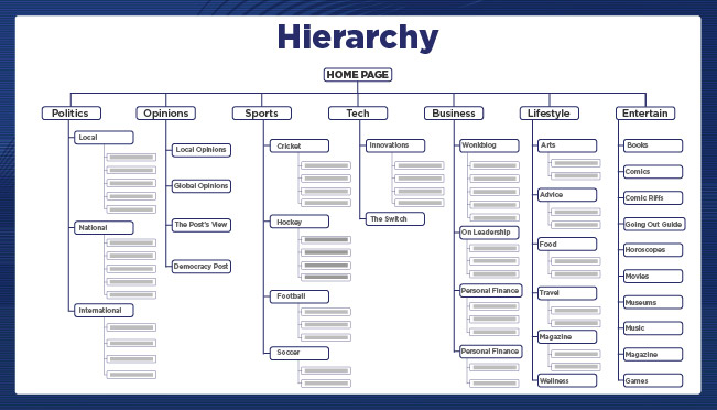
In addition to this, organizing the hierarchy of stories also involves adding the appropriate tags to the content, so that the layout is clean, and users are able to find these stories easily.
Did you know that 40-60% of users don’t go past the homepage of a news portal when they visit one? The reason for this surprising finding is that most often, the navigation of news portals are quite mediocre in the Indian context, and isn’t user-friendly. I can’t state the importance of content mapping and organizing enough but they lay the foundation for designing everything. Organizing navigation bar is going to feel like a breeze because you already have the highest priority module figured out.

In addition to this, multi-level navigation would further help guide users. You can play around with the hamburger menu and provide users with all the major modules under the tab itself; this will not only save readers time but also provide them with a seamless experience. The process of creating multi-level navigation includes segregating news pieces under certain headings, and then further putting them under more appropriate subheadings so that they’re easily found. For example, a heading could be, “Politics”, and under politics, the user could find subheadings such as, “International”, “National”, and “Regional”.
Take a look at any news portal today. You’ll find that the first fold itself, consists of about 30-40 news stories, which is way too high a number. In addition to this, these stories are presented as one-liners, along with numerous advertisements. This is too much information to bombard the user with, and often leads to the user getting distracted, and the content losing its place in the spotlight. A cluttered first fold never works well.
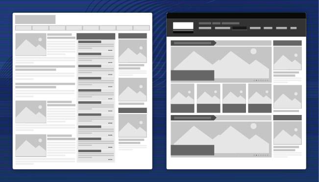
The first fold should ideally consist of a maximum of about 10-15 news pieces, as it ensures a simplified, non-intrusive user experience, and doesn’t confuse the reader. As you already know which news piece from.
I cannot stress the importance of typography for a news portal enough. It’s what can make or break your entire news portal design, as it’s the only way you can communicate the depth or intensity of the various news stories to the users. Content is king, and typography gives it the royal treatment it deserves, we have already spoken about it at length in our last blog on Top 5 fonts. The typography can give users a sense whether the story they’re about to read is a serious one, or a more fun one, for example. They’ll be able to easily differentiate between hard news and soft news. Every news story is extremely content-heavy, and typography is what can help users differentiate between the various elements of a news piece.
Playing around with the font size is crucial to help users understand the difference between the different elements in a news piece such as Dateline, subheading, byline, headline, and more. As a news story can have multiple levels of headers and a number of small action items, you can play around with the font size, to aid users in understanding what’s what and highlighting the important ones.

Although different colors can be used on a portal, I always prefer to use different shades of black and gray for the content. This again, helps users differentiate between the various elements present in a news piece. For example, the headline could be in charcoal black, while the subheading could be in a lighter shade of black. In addition to this, the dateline and byline could both be in different shades of gray. Basically, I prefer to use different shades of black and gray to highlight certain important elements of a news story.
Besides the color of the font, white spaces also play an important role on a news portal, as they allow the content to breathe, and contribute to a much better reading experience, as it’s lighter on the eyes.
Icons are an extremely essential part of a user experience in the news portal. A news portal is meant to provide users with the information they’re looking for, without making them think. After all, they’re there to read. And so, I find using obvious signifiers the right way to go about designing a news portal. Fancy or abstract elements as icons prompt users to think more, and also make it difficult for them to find what they’re looking for. Sticking with obvious signifiers is best, as it’s more likely that everyone will recognize them because we have been conditioned as such from the very childhood.
![]()
By keeping the above pointers in mind while designing a news portal, I always make sure that the content is the star of the show and also ensure a great user experience. After all, content is king.


