Why do some products feel good to use while others feel cold? The answer is often emotional design.
Think of a movie that moved you or an app that fits your day perfectly. Those moments are not luck. Designers create them on purpose.
Emotion also drives decisions. Harvard Business School professor Gerald Zaltman found that about 95% of purchasing decisions happen subconsciously. So emotional design is not just a creative choice. It is a business strategy.
In this guide, you will learn what emotional design is, Don Norman’s 3 levels of emotional design, 7 ways to apply it in UX, and real examples from brands like Duolingo, Airbnb, and Spotify.
Quick answer
Emotional design is a design approach that creates products people feel good about using. Coined by Don Norman, it works on three levels: visceral (first impressions), behavioral (ease of use), and reflective (meaning and memories). Examples include Duolingo’s owl mascot and Spotify’s personalized playlists.
Emotional design is a design approach that creates experiences that trigger emotions. It builds meaningful connections between users and products.
It goes beyond making a product work. It aims to make users feel delight, confidence, excitement, or pride. Designers achieve this with color, imagery, typography, motion, words, and interactions.
The idea comes from cognitive scientist Don Norman. His book Emotional Design: Why We Love (or Hate) Everyday Things showed that attractive, emotionally engaging products also feel easier to use. Read more about emotional design and its history.
Emotional design turns a working product into one people love. Here is why it matters:
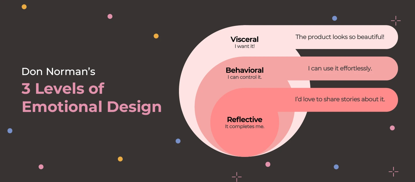
Don Norman describes three levels of emotional design. Each level shapes a different part of how people feel about a product.
| Level | Focus | When it happens | Example |
|---|---|---|---|
| Visceral | Looks, sound, and feel | First seconds | Apple iPhone’s sleek design |
| Behavioral | Usability and function | During use | Spotify’s smooth playback |
| Reflective | Meaning, memories, identity | After use, over time | Coca-Cola’s “Share a Coke” |
Visceral design is about users’ instant, gut reactions. It focuses on how a product looks, feels, or sounds. The goal is a quick positive response, like pleasure or excitement.
Example: Apple’s iPhone. Its sleek lines, minimal interface, and elegant finish make people want to pick it up before they know what it does.
Behavioral design is about usability and function. It asks how well the product meets user needs and how easy it is to use. The product must not just look good. It must also feel effortless.
Example: Spotify. Simple navigation, smooth playback, and smart recommendations keep users engaged and satisfied.
Reflective design is about the meaning, memories, and values users link to a product. It builds long-term emotional bonds. It also shapes how users see themselves through the product. Strong reflective design turns users into fans.
Example: Coca-Cola’s “Share a Coke” campaign. Bottles printed with people’s names linked the brand to friendship and special moments.
Emotional design only works on a solid base. First, make sure the product is functional and usable. Then learn your users’ needs through UX research and usability testing. With that in place, try these 7 techniques.
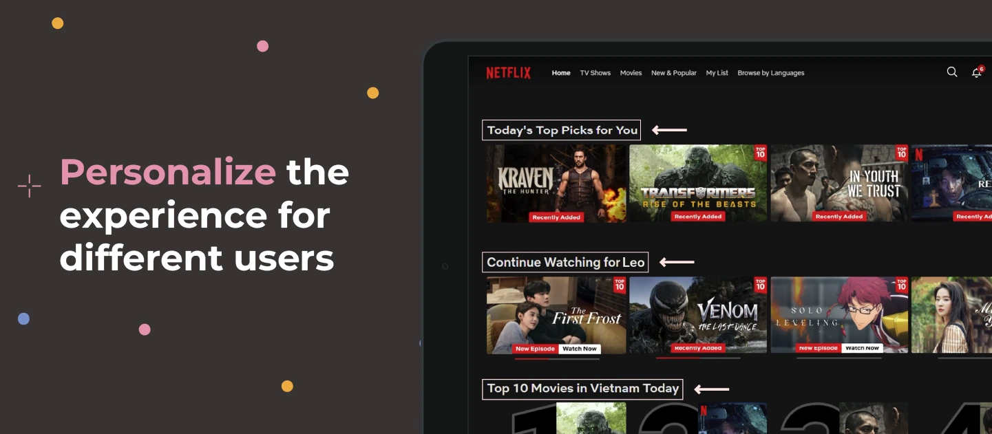
How do you feel when an app knows what you want? Understood and valued. That is the power of personalization.
Let users adjust content, layouts, and notifications. Use their behavior to tailor what they see.
Example: Netflix studies your viewing history and favorite genres. Every time you open the app, you see recommendations and thumbnails picked just for you.
New users don’t want to read long instructions. They want to see value fast.
Micro-videos are short clips, usually under 30 seconds, that show key features. They cut confusion and build confidence.
Example: Canva uses short videos to show new users how easy it is to create and edit designs. Users feel capable right away.
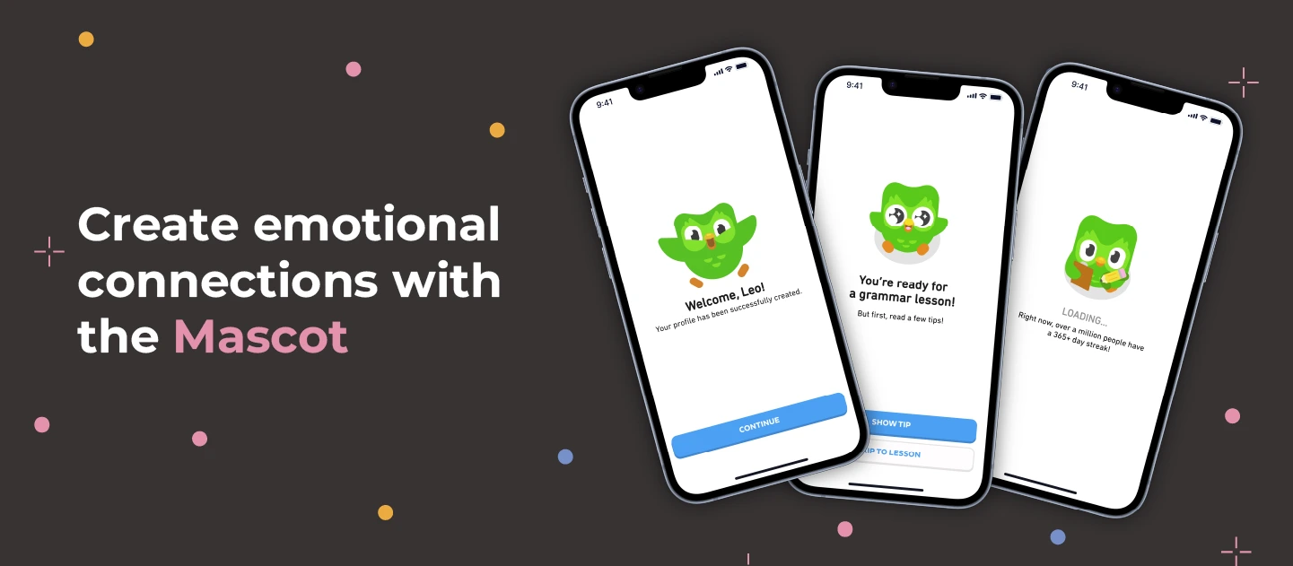
A mascot makes a digital product feel human. It adds warmth and personality. It can guide users, cheer them on, or comfort them when things go wrong.
Example: Duolingo’s owl, Duo. It celebrates progress, encourages daily practice, and nudges users who fall behind. Learning feels playful instead of tedious.
Everyone loves a good story. Storytelling is one of the most effective ways to share a brand’s values and purpose.
To use emotional storytelling in design, build a narrative around your users, not your features. Show real people, real journeys, and real outcomes. Help users see how your product fits into their lives.
Example: Airbnb shares stories of hosts and travelers instead of just listing properties. Booking a room feels like joining an adventure.
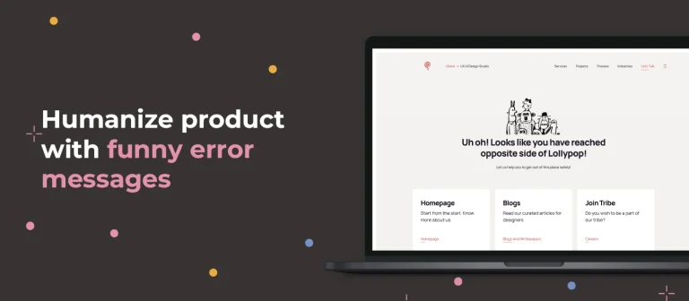
Nobody likes errors. But a friendly, funny message can turn frustration into a smile. It shows real people are behind the product.
Example: Lollypop’s 404 page greets lost visitors with “Uh oh! Looks like you have reached the opposite side of Lollypop!” Playful illustrations and clear navigation help them find their way back.
Colors trigger emotions. Warm colors like red and orange feel urgent or exciting. Cool colors like blue and green feel calm and trustworthy. But these effects only work if everyone can see them. Learn more about choosing a colour palette for products.
Example: Spotify’s dark interface uses bright green buttons and white text for strong contrast. It looks stylish and stays easy to read.
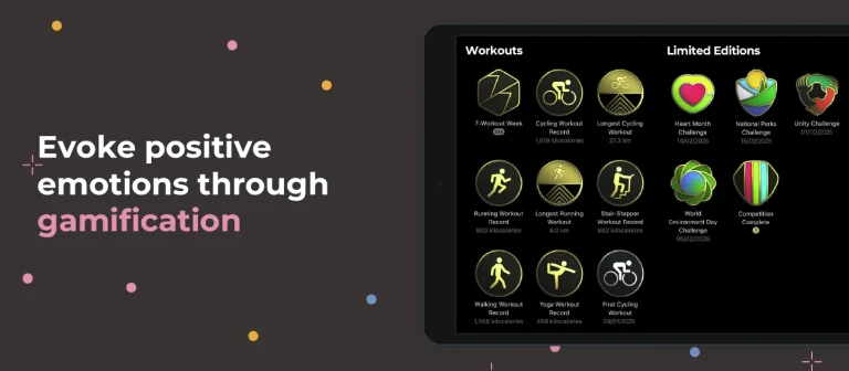
Gamification makes experiences rewarding and fun. Points, badges, progress bars, and leaderboards turn tasks into small wins.
The key is a sense of achievement. Give instant feedback, celebrate progress, and offer small rewards. This works especially well for learning, fitness, and productivity apps.
Example: Apple Watch’s Activity app awards badges when users close their rings or hit milestones. Visual progress keeps them motivated.
| Brand | Technique | Level | Emotion |
|---|---|---|---|
| Apple iPhone | Premium, minimal hardware | Visceral | Desire |
| Spotify | Smooth use, personal playlists | Behavioral | Satisfaction |
| Coca-Cola | Name-printed bottles | Reflective | Belonging |
| Netflix | Personalized recommendations | Behavioral | Feeling understood |
| Duolingo | Owl mascot and streaks | Reflective | Motivation |
| Airbnb | Host and traveler stories | Reflective | Connection |
| Apple Watch | Badges and activity rings | Behavioral | Achievement |
You can apply emotional design to any website or app interface. Start with these small touches:
Emotional design sits at the top of the UX pyramid. It works best once the product is already functional, reliable, and usable.
Want users to love your product?
See how we blend research, usability, and emotion in every design.
Related reading
Don Norman’s emotional design principles changed how we think about UI and UX. Great products do more than work. They make people feel something.
Start with a usable foundation. Then add personality, stories, and moments of delight. That is how you build products people remember and recommend.
Lollypop Design Studio, a Terralogic company, is a UI/UX design agency that creates products users genuinely connect with. We combine UX research, usability, and emotional design to bring your ideas to life.
We work with teams worldwide from the US, India, UAE, and Vietnam, including our UI/UX design agency in the USA.
Emotional design is a design approach that creates products people feel good about using. It uses visuals, interactions, and words to trigger positive emotions like delight, trust, and pride. Don Norman popularized the idea in his book Emotional Design.
Don Norman’s 3 levels are visceral, behavioral, and reflective. Visceral design shapes first impressions through looks. Behavioral design shapes the experience of using the product. Reflective design shapes the meaning and memories users link to it.
The emotional design pyramid, from Aarron Walter’s book Designing for Emotion, is based on Maslow’s hierarchy of needs. It has 4 levels: functional, reliable, usable, and pleasurable. A product must meet the lower needs before emotional delight can work.
Well-known examples include Duolingo’s owl mascot, Netflix’s personalized recommendations, Airbnb’s host stories, Apple Watch’s activity badges, Spotify’s high-contrast dark interface, and Coca-Cola’s name-printed “Share a Coke” bottles.
Build the story around your users, not your features. Show real people and real outcomes. Use imagery, microcopy, and onboarding to show how the product fits into users’ lives. Airbnb does this by sharing stories of hosts and travelers.
Emotional design increases engagement, loyalty, and satisfaction. It encourages repeat use and helps a brand stand out. Products that make users feel good are more likely to succeed and retain users over time.
Key trends include AI-driven personalization, interfaces that respond to emotion through biometric feedback, immersive AR and VR experiences, emotional analytics, and a stronger focus on ethical, sustainable design.