
A platform which offers a wide range of payment services to the vast majority of the unbanked and underbanked population of Nepal, who live in rural areas.

The application design for IME Pay was extremely challenging as the app offers a wide range of payment services to the vast majority of unbanked and underbanked customers of Nepal from rural areas. In addition to that, poor internet connectivity and low literacy levels posed new difficulty levels.
Our clients were IME Digital Solution Ltd., a Nepalese fintech, which aims to provide digital financial services to customers in partnership with banks, telecom operators and other businesses. They approached us to redesign their existing ‘IME Pay’ application and create a marketing website for the same. They wanted us to also create three versions of the IME Pay app – the customer-facing app, the agent facing app and the business facing app.
The goal was to redesign the experience customers have by making the app simple to use and reduce the number of required steps.
The research started off by making sure that the target audience was understood very well and the context in which the app would be used. Grasping the context of the users in Nepal was a bit challenging at first. Over the course of the project, the clients helped us by providing all the necessary information as to how the apps would be used and how the different users would interact. Multiple meetings were required to understand how a solution would work if internet accessibility was limited. In such a case, it was important to provide the users with transaction updates and error states while the app was offline.
The IME Pay ecosystem was studied closely to reveal who the stakeholders were and what role the IME Pay agents played. They were set up across Nepal to help customers perform transactions that required assistance. Ultimately, these are the different personas that were outlined – Customers, Merchants/Business owners, and IME Agents. From here, the information architecture for all three apps was mapped out.
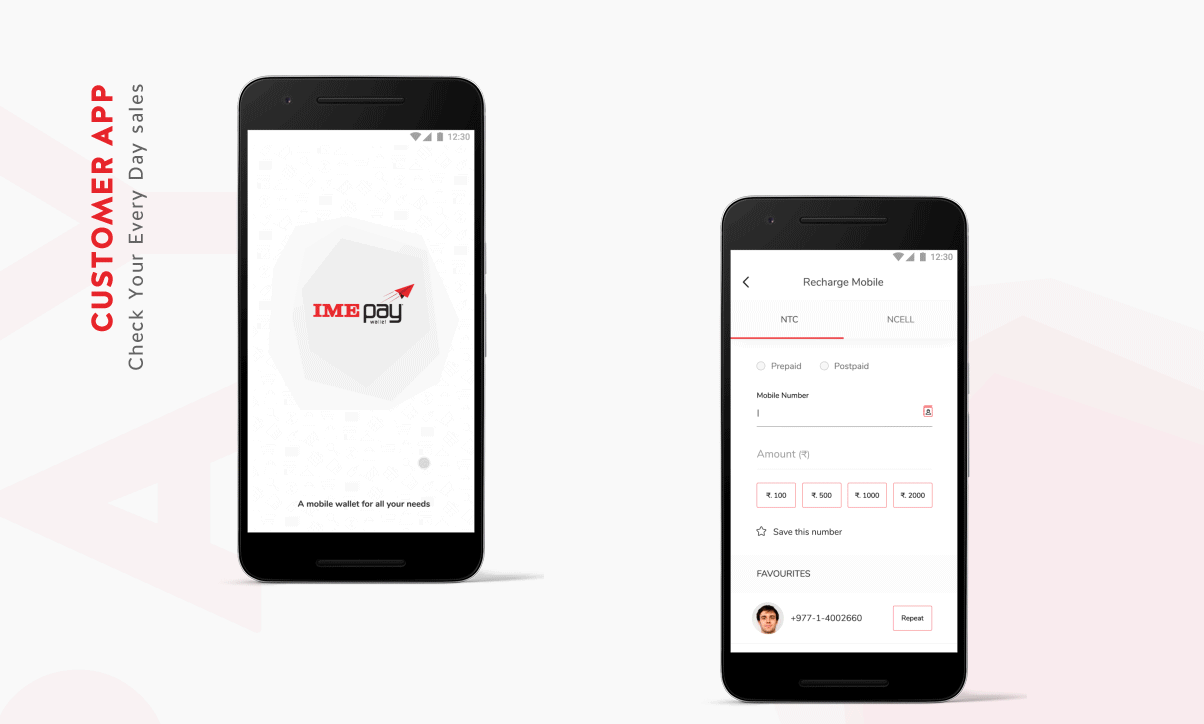
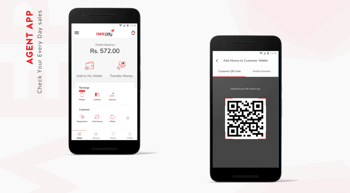
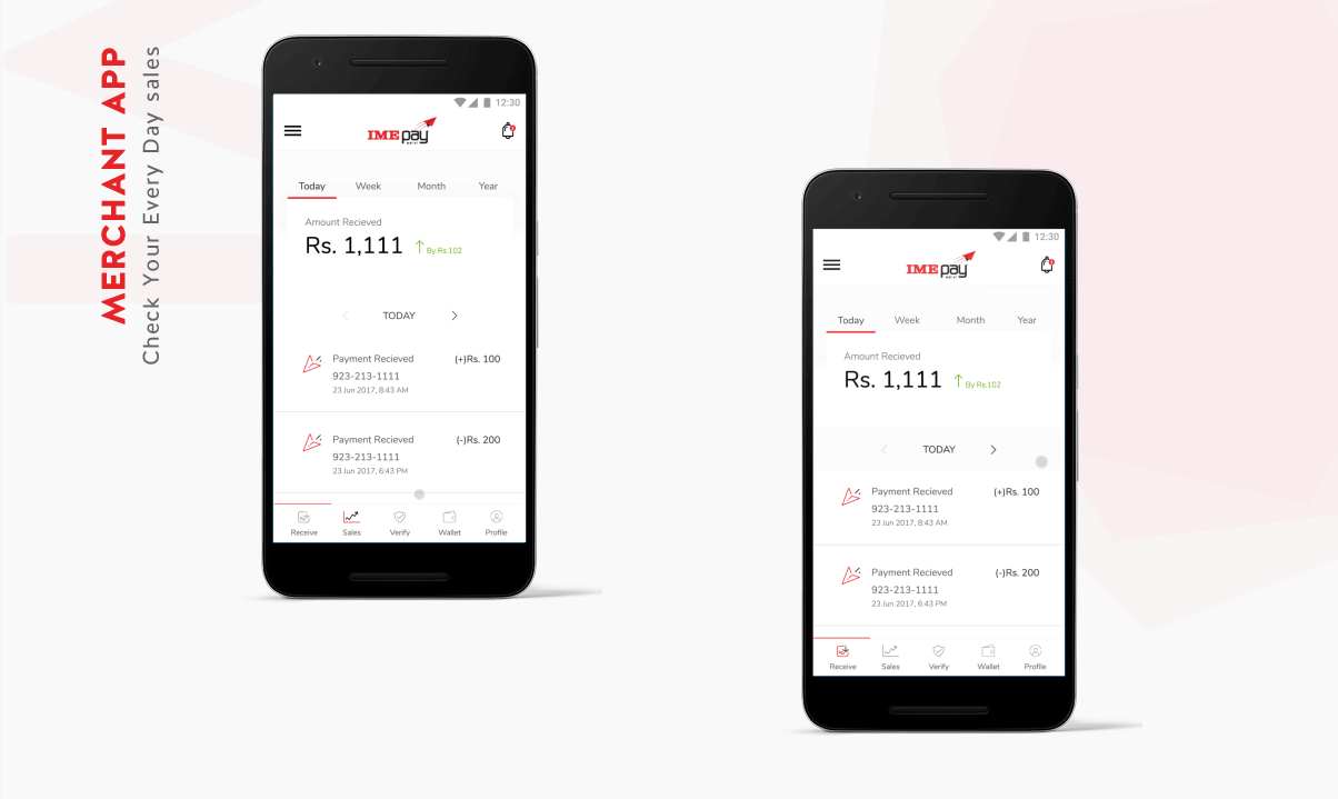
The apps were structured such that depending on the user type, the navigation and default landing page changed. The most useful features for each type of user were presented on the Homepage. For example, for a Customer, the Scan QR code action was given prominence along with frequently accessed actions like Send, Add money and Balance check. For a Merchant/Business owner, the default home page showed them their sales over the week, month and year. Similarly, for an Agent, Recharges, Customer verification and Customer assistance in adding money were given more importance along with adding and transferring money to their own account.
On the foundation of the application, we went on to design the app’s marketing website.

Since there were three applications to design for, we wanted to keep the overall look and experience similar across them; hence, the navigation, layout and colour themes remain constant throughout. Red and Black were used as primary colours as they are the brand colours and to balance out the harshness of Red we introduced Grey as a secondary colour.
Considering that our designs are for people from the rural background as well, we had to ensure that information was upfront and easy to understand and hence, card layout was used while giving enough breathing space along each element. The background was kept white to highlight the content and increase readability. Also, Helvetica font was used as it loads the fastest, being a default font.
To give a more personalized feel to the app, we opted for custom icons and illustrations and for reinforcing the brand image, primary colours were used in them. Further, for a better understanding of the app, special illustrations were created for the onboarding stage.
Thus, all the visual elements have been kept simple for easy usage, while being highly efficient to assist the user in navigating around the app and website.


I was extremely impressed by Lollypop’s timeliness.
Shweta Bagla
Sr. Marketing Officer, IME Limited


